Veldsink Advies
Insurance advisor and customer CRM design
2024Project outline
For this project, I was responsible for redesigning both the customer portal and the advisor portal. Together with a small team of four, I also helped design and implement a new design system from scratch called Flux UI. The system was integrated into the low-code platform OutSystems, providing developers with a consistent and scalable foundation for building the application’s interfaces.
Throughout the project, I worked closely with the Product Owner and Lead Developer as part of what we called the Three Amigos. Together, we refined user stories and translated requirements into structured solutions using the Epic Framework, a visual planning canvas that served as a single source of truth across design, development, and product. I was responsible for designing, implementing, and maintaining this framework to improve alignment and collaboration between disciplines.
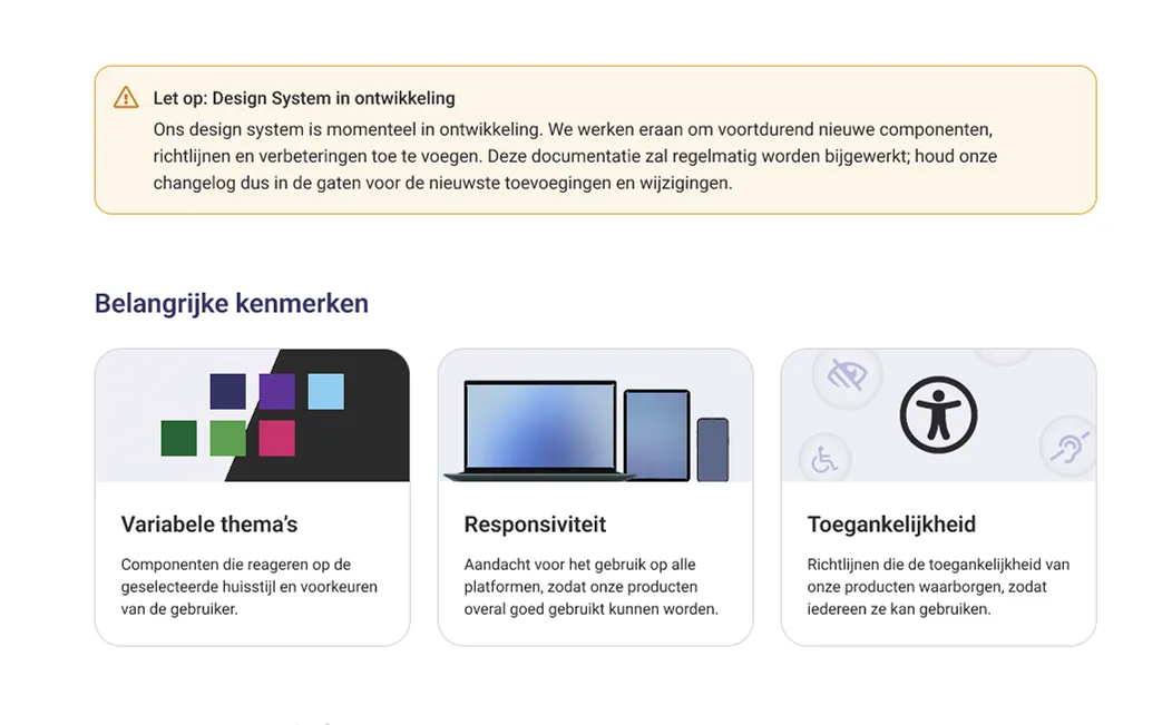
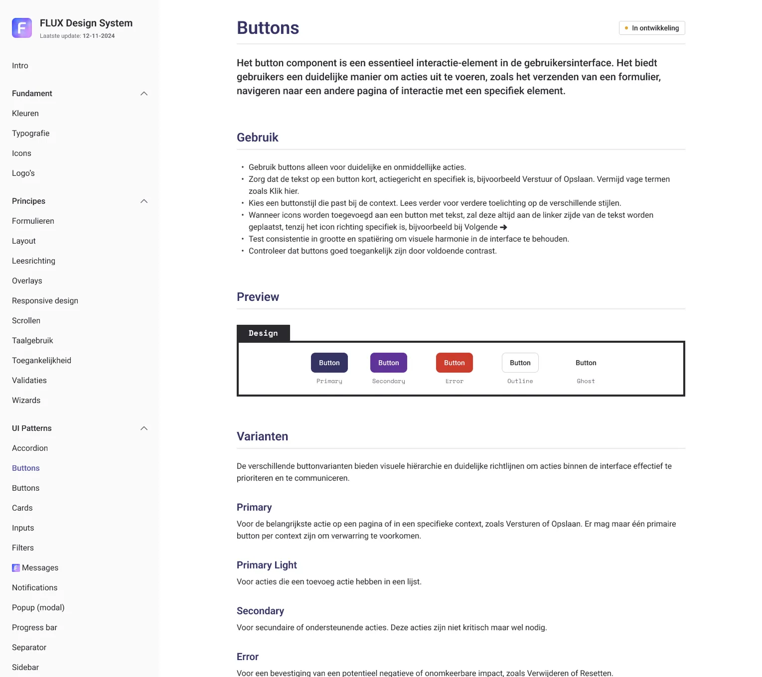
FLUX design system
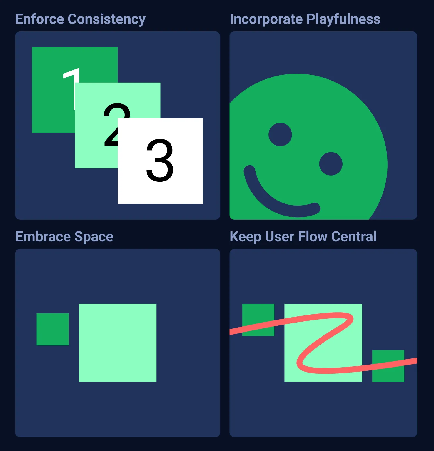
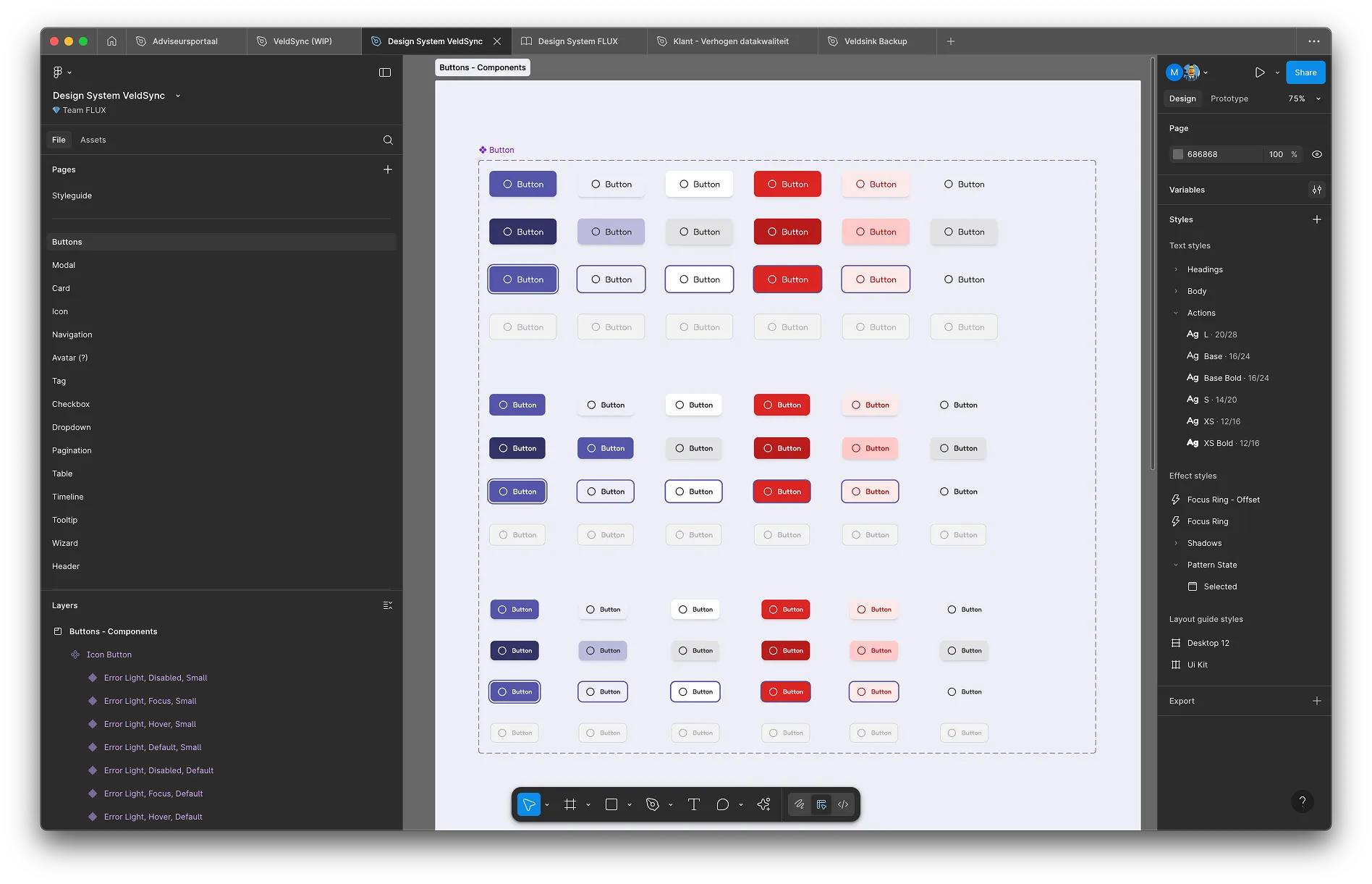
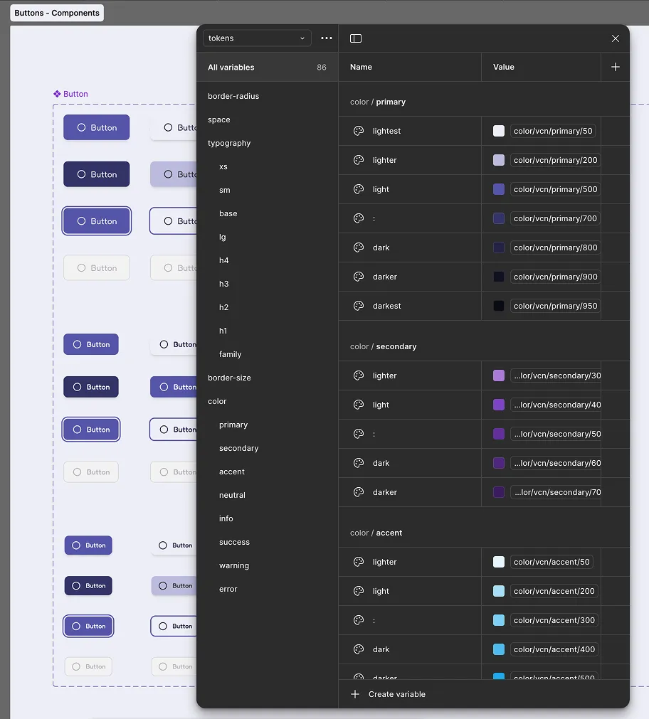
We developed in-house a custom design system to support both the Advisor portal branding and the Customer portal branding. We initially based the system on the mature and clean design system foundation shadcn. Since the design tokens had to be consumed by both Figma and Outsystems, we stored all tokens in JSON format in Github, so we could version changes and have a single source of truth. The design system documentation was also done in Figma, and with any addition or change this live document was automatically updated. This way we could keep all development and design teams aligned. I personally wrote the FLUX manifesto on what and what not to do, principles to follow and an in-depth explaination why certain design decisions were made. To ensure the best course of action these design decisions could be challenged with solid arguments in order to pin the best decisions in a democratic fashion.
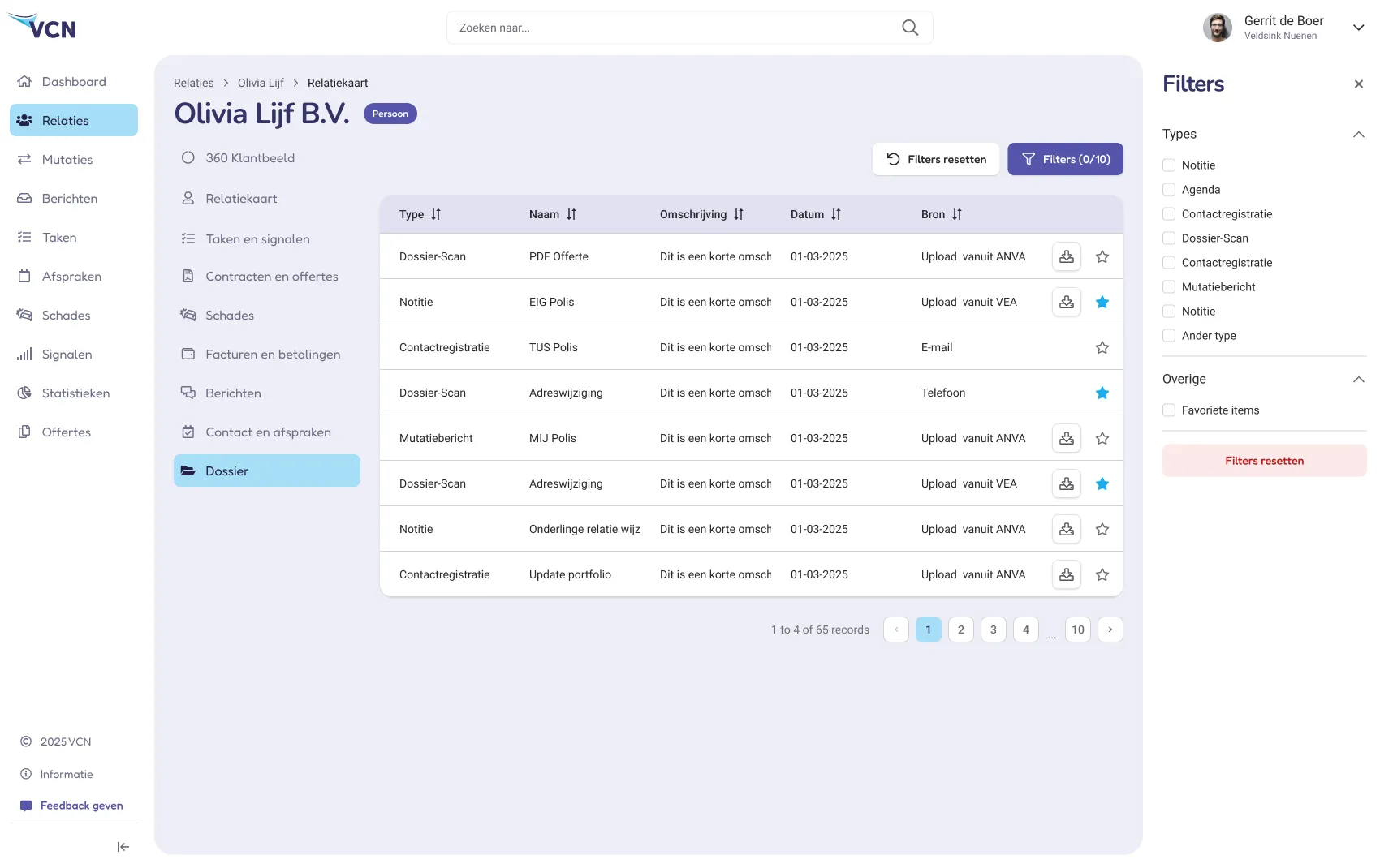
Advisor-client contact registration
To properly understand the end user we performed a number of user studies internally and at external offices. I would visit branches and sit down with users of the current software, and take notes of their day to day activities. Looking over their shoulder I would take note of their struggles and tasks they liked doing. We would implement these findings in the designs and prototypes, and with small user groups test them on actual users.
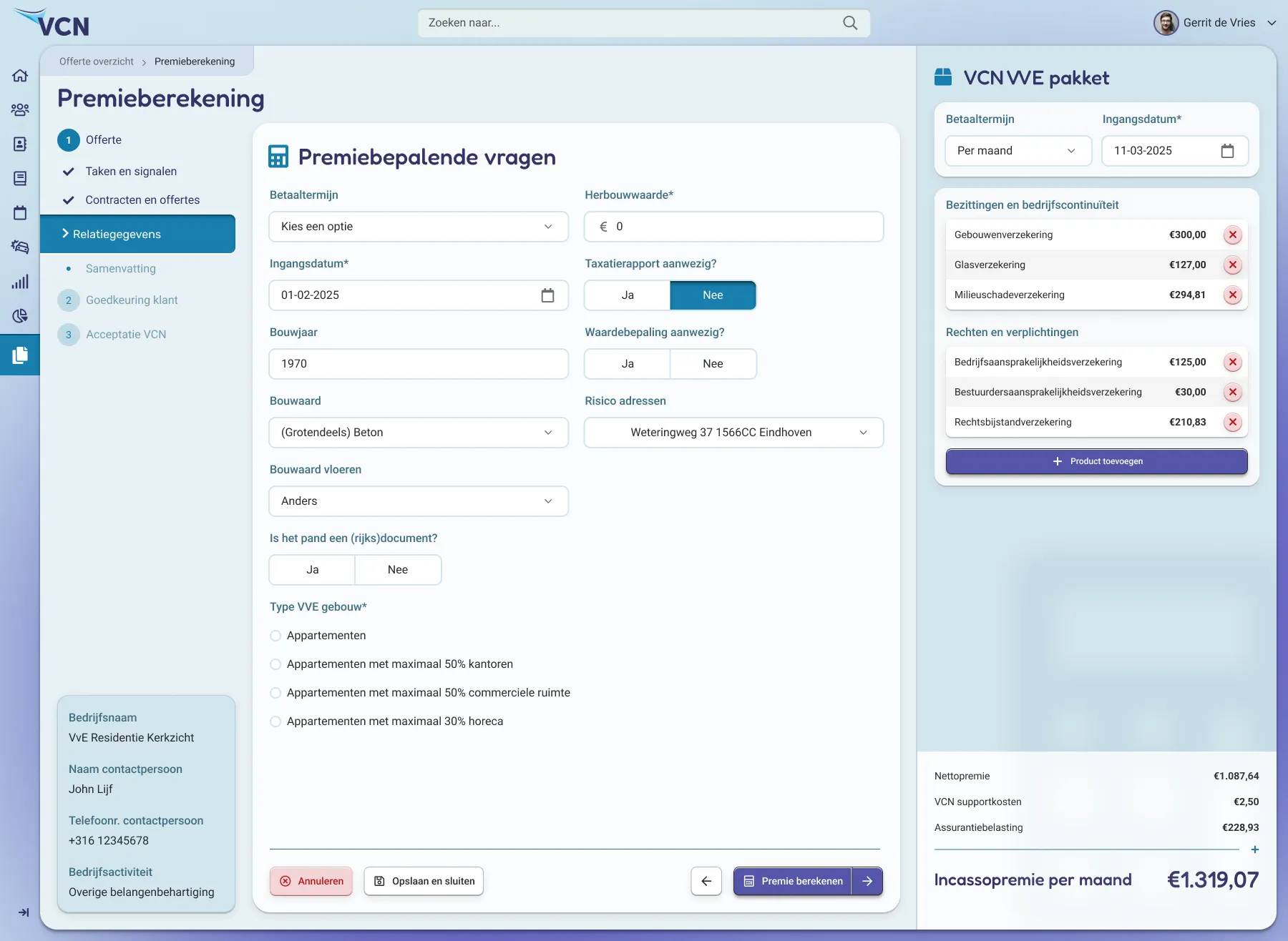
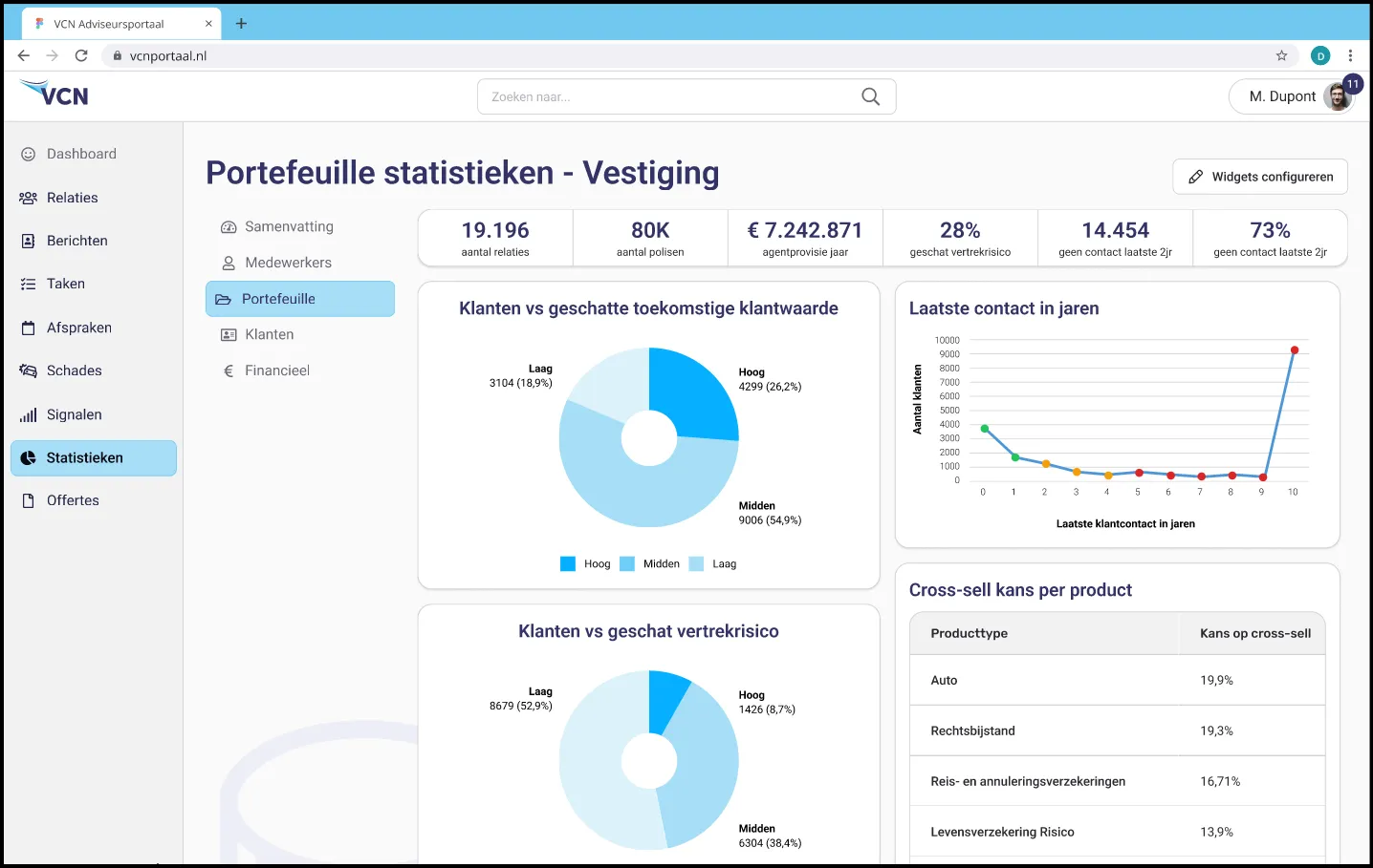
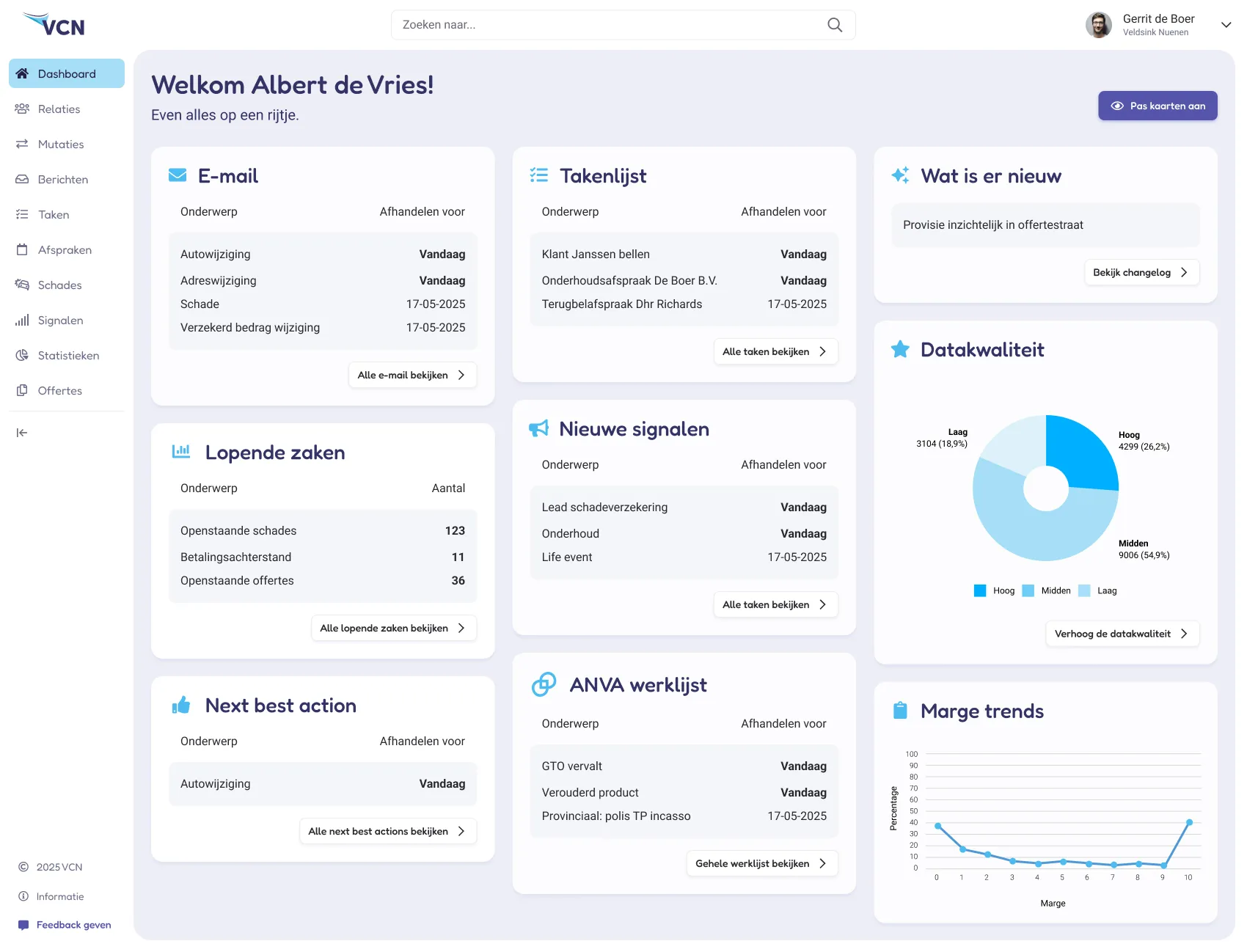
Advisor portal designs
To support the transition to the new advisor portal, we designed and executed a fade-in, fade-out migration strategy. Instead of replacing the legacy system all at once, we gradually extended the existing software with new functionality while giving advisors the option to switch between the old and new interfaces. This approach allowed advisors to continue their daily work without interruption, become familiar with new features at their own pace, and enabled us to phase out the legacy system over time.

Customer personal data update flow
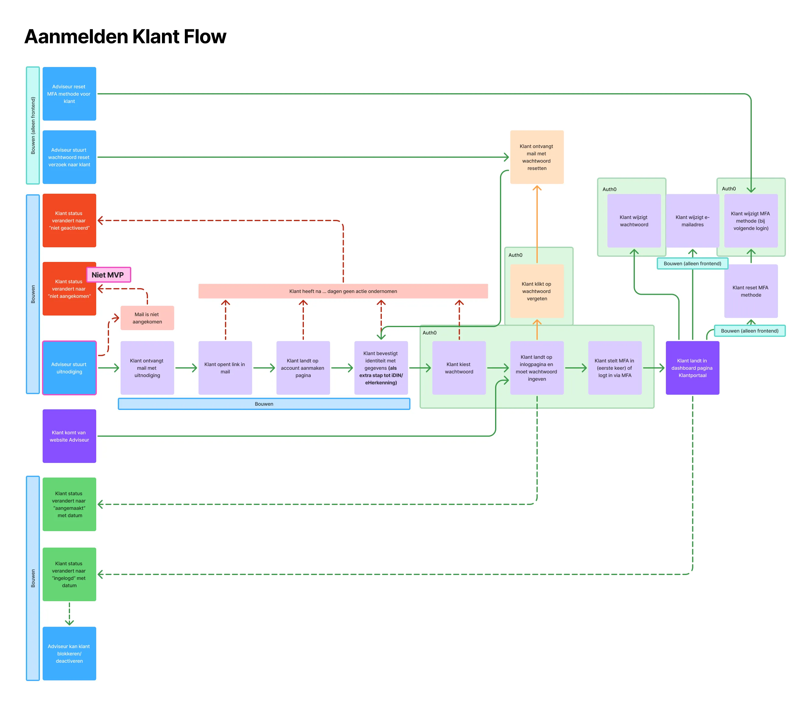
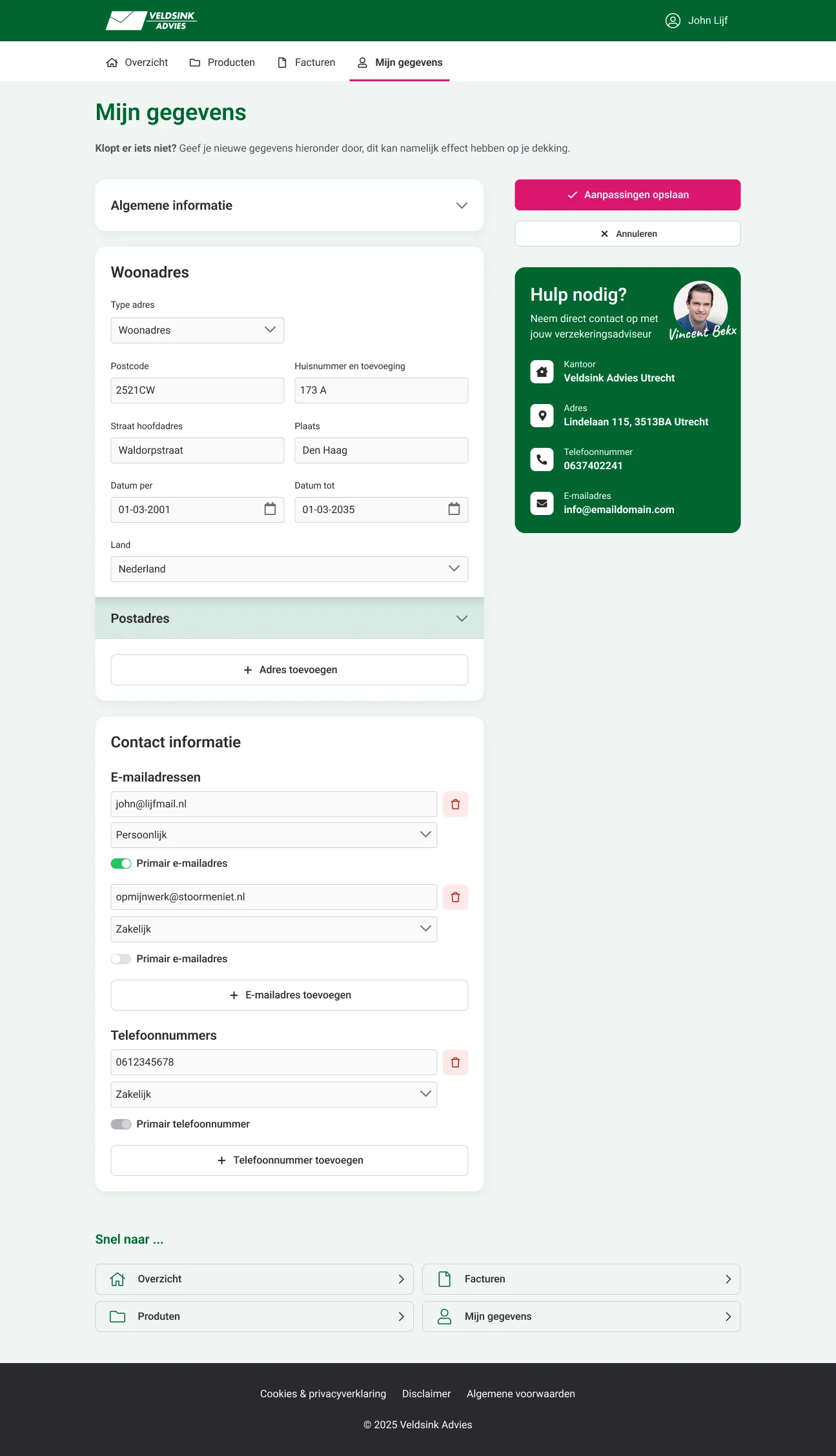
On the customer side, I helped define, design, and implement a flow that invited customers to review and update their personal information. This improved data quality for advisors while also creating a natural touchpoint to introduce customers to the upcoming self-service portal, where they would be able to manage their products, documents, and communication independently.
Customer portal designs
Veldsink Advies was originally a traditional, relationship-driven organization where clients typically visited a local office to meet their advisor in person. One of the key challenges was preserving this sense of personal attention and approachability while moving part of the customer journey to digital channels. To address this, we introduced regional head advisors as on-screen video avatars who communicated important information in a friendly and informal way, helping to maintain a personal connection in the digital experience.

Responsive design & UI prototypes for development
Since we knew the exact setup of the insurance advisors (2x 1440p monitor) we could optimize the layout to fit their needs best. I established a number of principles to work from, which were central in the design and excecution of the front-end. The main principle was to use space wisely and allow horizontal expansion. From left to right, from small to large there was a strong and consistent information hierarchy throughout the application. We also took responsive design to the next level, what we called Respectful Design, which meant to design the application to be as fluid as possible to allow the end user to dictate how they want to consume the information. Navigation panels that could be minimized and cards that would rearrange themselves depending on the available space was made as a core principle.
Conceptual sketches
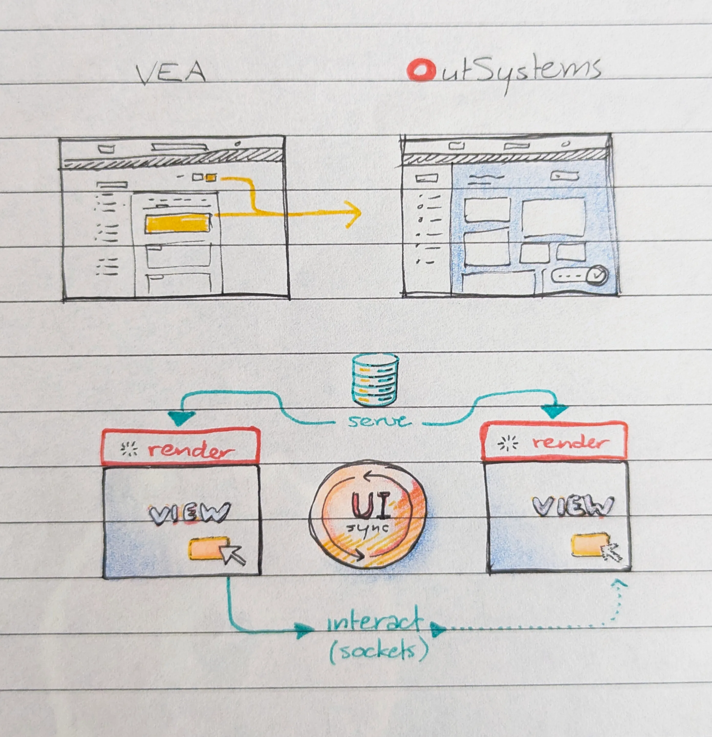
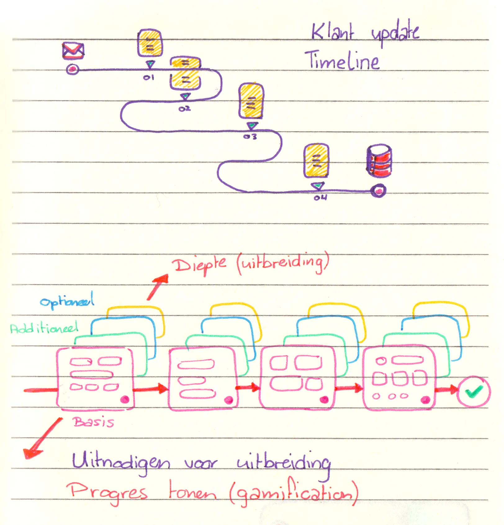

Visual templates for internal presentations